WÜSTHOF LOGO
CLIENT – Wüsthof
PROJECT – Logo redesign
AGENCY – AgencySacks
ROLE – Designer
CHALLENGE
Wüsthof has been a family-owned company since 1814, when they started producing their famous knives in Solingen, Germany “the city of blades.” They wanted their logo redesign to nod to this history of craftsmanship while positioning the company as modern and competitive in a crowded market.
CONSIDERATIONS
Differentiation: Although they were one of the first knife companies with a red logo, they no longer stood out (see competitive set at right.)
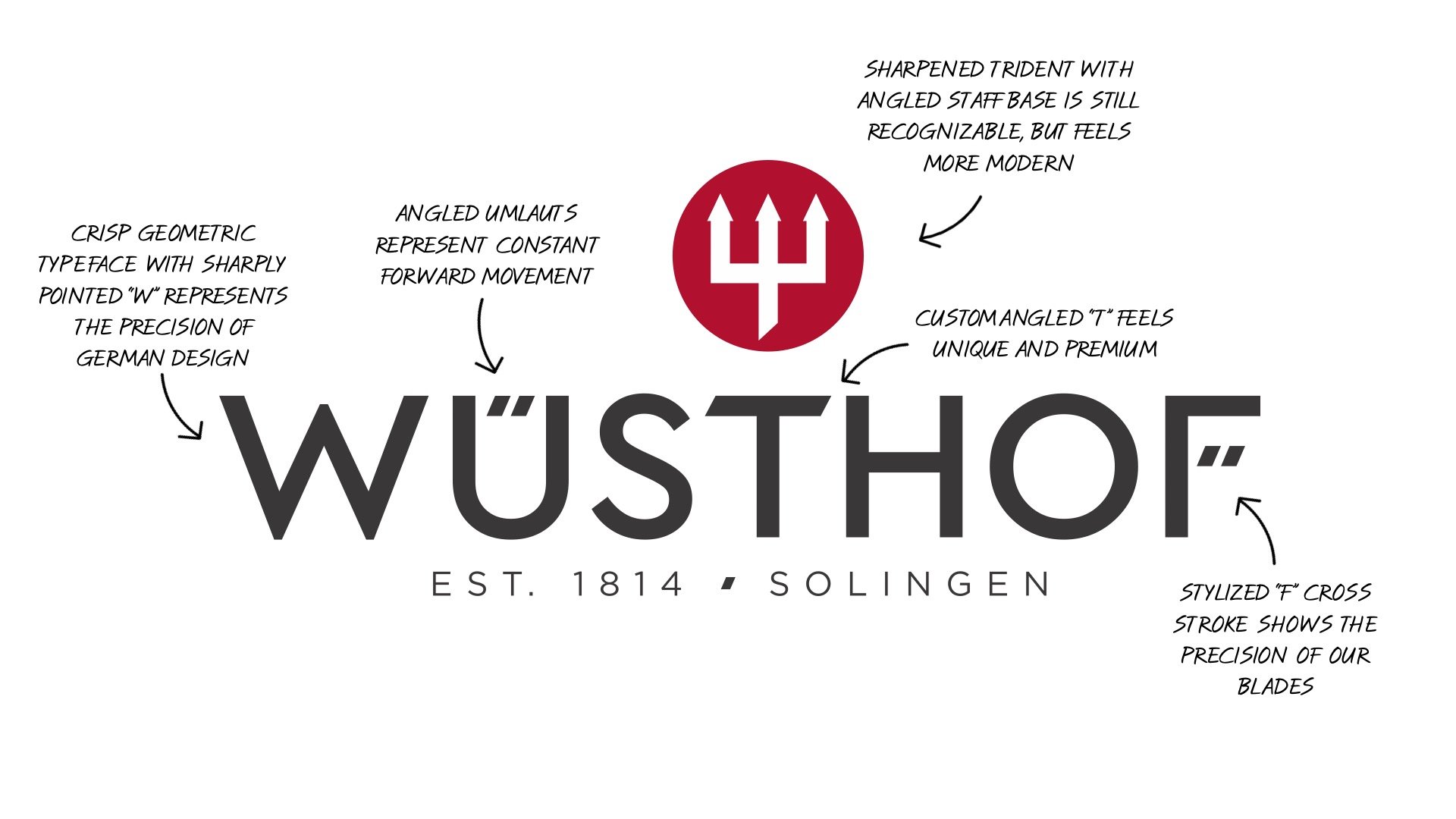
Simplification: Wüsthof’s previous logo/wordmark had too much going on – drop shadows, 3D effects, and bold italics. Our first step was convincing them that simpler was better – and more effective for various applications.
The umlaut: Embracing this a typographic element reinforced Wüsthof’s German history and quality. We explored unique ways to incorporate it into the wordmark.
Small steps: When a company has existed for over 100 years, they’re not always in a rush to change…we quickly learned that nudges in a new direction were more effective than leaping to a more drastic redesign.
WÜSTHOF LOGO EXPLORATION
TRIDENT EXPLORATION


